


SERIOUS
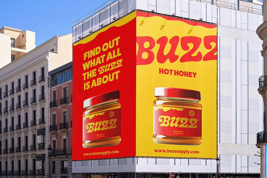
BUZZ's logo and stylistic elements represent both the traditionally smooth, sweet flavor of honey and the added spicy kick through a combination of rounded and sharp, angular forms. This juxtaposition serves as a subtle reminder of what BUZZ is all about. The bold, tongue-in-cheek copy encourages customers to add Buzz to their meal - almost daring them too, really. Whether it's through color, imagery, or language, BUZZ isn't afraid to be bold and in the customers' faces. After all, the heat this honey packs sure isn't.
BUSINESS
BUZZNESS


THE A, BEE, Cs
BUZZ further embodies the contrast of sweet and heat by combining a bold, all-caps display font with a considerably more rounded, softer serif font. The additions of almost pure white and black in the color palette for specific, need-be cases support BUZZ's dynamic feel, helping the red and yellow stand out even more.


SPICE
CLOUD
STRIPE

SWEET


EXPANDING THE HIVE
BUZZ's social media uses the brand's colors and typography to stand out from the crowd. The images are immediately attention grabbing and quickly scannable to hook customers without overwhelming them. Posts largely include foods that pair well with the hot honey flavor to inspire both new and existing customer alike.

